This Ugly Ad Saved My Business
 I recently had an opportunity to promote my side business with a banner ad. For several reasons—mostly procrastination—I made a banner ad that was ugly as sin and went against all common sense…
Then it worked better than ever expected, and it saved my side business.
Continue reading for the short story, followed by lessons you can apply to improve your own conversion rates.
The Challenge
In addition to helping companies with user acquisition, I run GagCartoons.com. It’s a site that lets cartoonists monetize their unpublished single-panel cartoons, and helps companies find funny cartoons to use instead of boring stock photos.
As with most marketplace services, I faced the chicken-and-egg problem. I needed to recruit cartoonists (sellers) to have something to sell, and companies (buyers) to license those cartoons and validate the business model.
Trying to solve both problems at once was getting increasingly difficult, and my perseverance was beginning to wane.
The Opportunity
The Daily Cartoonist is a blog about the cartooning industry. After supporting their Kickstarter campaign, I got a voucher for one week of display advertising on their site. I was in no hurry to use the voucher, because I had several “common sense” assumptions about display ads:
- Everyone knows display ads don't convert well. If I'd find an effective source of contributors, it certainly wouldn't be through display ads.
- Banners need to be professionally designed. Either I'd spend too much time in Photoshop or too much money on a designer.
- Users ignore banner ads. Also known as ad blindness. The ad would need to be obnoxiously bright, animated, or intrusive to get any attention.
- The message needs to be perfect. With so little space and time to convince the viewer, the message needs to be perfected through hours of meticulous copywriting.
Tired of seeing the voucher on my to-do list, I finally scheduled a week in which to run the ad. The low expectation led me to procrastinate until the night before to start working on the banners. Short on time, I got desperate and began questioning my “common sense” about display ads…
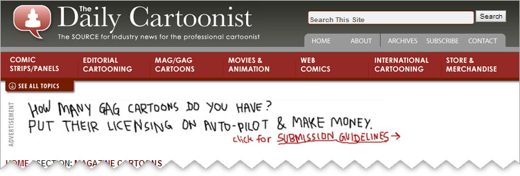
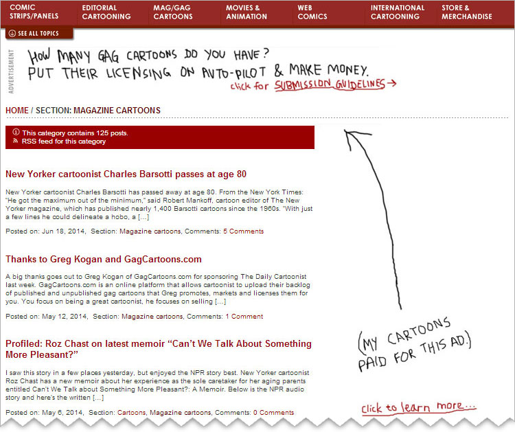
- What if the "design" is just scribbles on a white background? Desperate justification: Incredibly ugly things get attention.
- What if the message is just a simple value proposition? Desperate justification: Everyone's interested in making more money with less work, no matter how it's phrased.
With nothing to lose and low expectations, I made these two banners—shown here as the visitors saw them:
 (I also quickly typed up a landing page for the ad. The page simply explained the value proposition and encouraged cartoonists to email me to become a contributor.)
The (Surprising) Results
Ugly ads rock.
- 126 unique clicks from 3,000+ views, with a 4.2% clickthrough rate. That's 105x better (!!) than the average rate of 0.04% for display ads.
- 19 cartoonists became contributors after clicking through the ad, at a 15% conversion rate.
- 3,121 cartoons have been added to GagCartoons.com as a result of this ad. That's a 3x increase to the inventory.
The chicken-and-egg problem is now partially solved, because there’s now a large cartoon inventory relating to many topics. This lets me focus on the other half of the market: businesses and content creators.
More importantly, I learned that testing common assumptions can result in uncommon results.
Lessons Learned
- We have an intuitive sense for how certain elements on the web should look. For example, you can easily imagine what a typical login page, contact form, or SaaS pricing chart looks like. Following common sense usually results in saved time and effort. But...
- Testing common assumptions can result in big payoffs. Designing a plans & pricing chart? Try something other than a horizontal table. Developing a sales landing page? Test a version without any text formatting... You get the idea.
- Understanding exactly what your audience wants outweighs everything. Everything else is secondary.
Have you been doing something just because it’s common sense? Test something different, even if it’s ugly.
◼
PS - Liked this article? I write one every month or so, covering lessons learned on B2B startup growth. Don't miss the next one:
If you need help with marketing and revenue growth, get in touch.
 Greg Kogan