 Greg Kogan
Usability Testing is Easier Than You Think
As a founder or member of an early stage startup, you know you should be talking as much as possible with your potential customers. You know speaking directly with your potential customers will teach you more than an entire week of brainstorming with the smartest people in the business. You understand the value of seeing potential users go through your site, and of hearing their thoughts in real-time.
Right?
So when was the last time you did any of this?
This is called usability testing, and it’s one of the most effective things a startup can do to learn about its audience and increase signup rates.
(If you don’t believe this, skip down to the results and see how much you can learn by doing usability testing.)
And yet, you’re not spending any time on usability tests, because:
- It's too time-consuming, and you already have too much to do.
- You need to hire a marketing firm to do usability tests, which is costly.
- Finding quality participants for the test will take a lot of time and money.
- Usability testing requires fancy (ie, expensive or complicated) software.
- Usability tests—like any marketing area—are soft, gray, and hazy tasks. Better to spend time on real, tangible problems.
These assumptions are enough to prevent most startups—including yours—from doing usability tests. That’s a shame, because these assumptions are absolutely false.
In this case study I’ll show you how one B2B startup collected 20 pages of actionable feedback directly from their target audience, with just $315, 6 hours of effort, using Google Hangouts and Google Forms. You will see that user testing is easier to do than you think, immensely effective, and can be started today.
Case Study
The Challenge: Avoiding the Pitfalls of Survivorship Bias
Scalyr is Software-as-a-Service (SaaS) for server log management and monitoring. They have a specific audience in mind—startups who want an easy way to get their server operations under control—and they’re laser focused on meeting the needs of that group. They understand the value of speaking to early customers, so they already reach out to users with support and requests for feedback.
Getting feedback from early customers is important, but it suffers from survivorship bias. That is, you’re only talking to those who made it through the sign-up process (the “survivors”), and ignoring those who came and went without signing up.
Who are those people who came and went? What was their first impression? Did something on the homepage drive them away? Was it something on the pricing page? Did something confuse them? Which parts of the site did they read, and which parts did they skip? … You’ll never know if you’re only speaking with your users.
To answer these questions, we decided to run live usability tests with potential users who were not previously familiar with Scalyr.
The goal was to learn what a first-time visitor thinks as he/she reads and navigates the site, so we can improve the content and increase the number of signups from future visitors.
Methodology: How We Ran Successful Usability Tests, and You Can, Too
1. Planning (15-30 minutes)
A short chat is all it took to agree on logistics:
- Tests to be done live, over Google Hangouts (or Skype) using screenshare, with one participant at a time.
- One person to conduct the test, and another person to take notes.
- Each call planned for 30 minutes.
- A $35 gift card from Amazon to be sent to each participant as a "thanks" after each call.*
To get the most from each call, we structured the conversation using a script. The script contained a basic introduction, instructions for the participant, and a series of open-ended questions. The questions included instructions to perform certain tasks, so we could see how easily (or not) a visitor is able to find important information on the site.
For example, the questions included:
- What would concern you about this service?
- How would you describe this service to a colleague?
- What are some alternatives you would mention?
(See my sample script on GitHub Gist.)
* All that’s needed to claim an Amazon gift card is the “Claim Code.” You can buy them in bulk and have them all emailed to you, then you can just forward the individual claim codes to each of your participants.
2. Getting Qualified Participants (15-30 minutes)
Feedback from a usability test is only useful if it’s coming from someone within your target audience. We didn’t want to spend time and money on just anyone who’s willing to chat with us for 30 minutes for a gift card. On the other hand, we didn’t want to make it strictly invitation-only, because that would limit our pool of candidates.
The solution? We created a simple Google Form—they’re easy to setup and share—to get information from wiling participants. Here is the actual form we used:
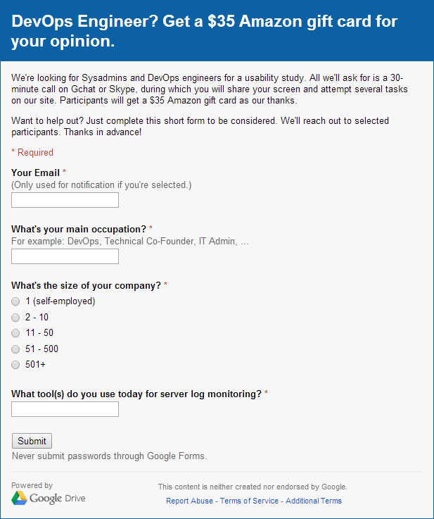
Notice there’s no mention of the company. You don’t want the participants to look at your site before your usability call, so keep your company name undisclosed if you can. (This also means sending emails from a non-company address before the call.)
We shared a link to this form on two Reddit communities related to the server monitoring industry. Even without receiving massive amounts of votes, many dozens of people signed up to participate in the usability test. Within one week we had over 50 willing participants.
Despite whatever presumptions you may have of Reddit, the quality of candidates was great, and even included employees of multi-billion dollar companies. (I admit to having been surprised myself.)
With enough participants on the list, we selected 32 individuals for our test and emailed them this invitation (from my personal email address):
Hi [Name],

You recently applied to get a $35 Amazon gift card for participating in a usability study for DevOps engineers.

I'd like to invite you to participate in the study. It would just be a 30-minute call on gchat or Skype with screenshare, during which I'd ask you to look at an online DevOps service and perform a few basic tasks.

And that's it! You'll get the $35 Amazon gift card right after the call.

If you're still interested in participating, please let me know your availability for a 30-minute chat during any of these times:

(All times are EDT / GMT-4)
- [Available dates and times...]

Thanks in advance for your participation!

Greg
In the end, we scheduled 10 calls—a response rate of 30%.
Due to scheduling conflicts, a week went by between posting the opt-in form and sending out the invitations. Had the invitations gone out sooner, we believe the response rates would have been even better.
3. Conducting the Usability Test Calls (4.5 hours)
One by one, we conducted a 30-minute call with each participant. I went through the script while someone from Scalyr took detailed notes.
In all, we had 20+ pages of notes full of valuable, insightful, and feedback (sometimes unexpected). All from our target audience. I challenge you to name any other activity that gets you this much valuable information for equal effort and cost.
Common issues we faced during calls and how we addressed them:
- Participants hesitant to think out loud. I emphasized that I'm not the owner of the product, and therefore they cannot offend me. This drew a chuckle from most people and warmed them up to sharing their thoughts openly.
- Participants taking conversation off topic. Some friendly chatting is fine, but if the conversation started to go astray I would kindly interrupt and ask to go through just a few more questions in the time we have.
- Participants being late. We decided in advance which questions were less important than others and therefore could be skipped to save time.
- Participants not showing up. This only happened once, and unfortunately is unavoidable. This is why you send the gift card after the call, not before.
We sent a follow-up email after each call. The email thanked the participant, included the gift card claim code, and encouraged them to check out Scalyr (without being pushy).
4. Turning Feedback Into Action (30+ minutes)
Following the tests, we reviewed our notes for actionable information. For example:
- Someone's organization doesn't allow the use of cloud-based services = Not actionable.
- Someone had difficulty understanding the pricing chart for reasons X, Y, and Z = Actionable.
Then we organized them by topic and turned them into tasks. For example, ”Wasn’t expecting the ‘contact’ link to open a mail client” turned into the task “Create contact page with simple form, and direct all contact links there.”
And finally, we prioritized tasks based on magnitude (how important is this to the visitor?), frequency (how many times was this mentioned?), and effort required (how easy or difficult is it to fix this?).
Results: Insight and a Better-Performing Site
For a startup team, the insights gained by watching and hearing a potential user walk through your site or product for the first time is invaluable—and accordingly difficult to quantify. (Hence the term qualitative data.) Most of these qualitative data are business-sensitive, but here’s a sampling of lessons learned:
- Don't underestimate people's tendency to scan or skip over text. Even with a sparse homepage, participants scanned through it speedily and formed assumptions within seconds, some of which were incorrect. Keep text concise, eliminate marketing fluff, and break down text-heavy pages into easy-to-scan chunks with distinct headers.
- Design trends don't always result in better sites. Like many modern sites, the Scalyr homepage was professionally designed with generous margins and whitespace between elements. Guess the most common complaint about the homepage from participants? "Too much space."
- Your content probably isn't saying what you think it's saying. For example: The Scalyr homepage contained logos of cloud hosting providers such as AWS and Linode. A small message above the logos read: "Works wherever you do." This was meant to say that Scalyr integrates easily with these cloud hosting providers. One participant interpreted this to mean that Scalyr is a self-hosted solution. (It is the opposite of a self-hosted; it's a cloud-hosted service.)
The actual list of lessons learned is 10 times longer and much more specific. Yours will be, too.
These are real issues that affect your signup rates—the bottom line!—and there’s no way to learn about them other than doing usability tests.
Additionally, here are some measurable results from the Scalyr site following improvements based on our usability tests, which only indirectly show the tests’ value:
- -30% Overall Bounce Rate. From hearing participant's first impressions, questions, and frustrations, we modified site content to address many of them and significantly lowered the percentage of visitors who leave immediately.
- -17% Exit Rate from Pricing Page. We acted on specific frustrations or confusions about the pricing page, and decreased the percentage of visitors who leave the site from this page.
- +30% Average Time Spent on Features Page. We changed the features description page from a big wall of text into a segmented and more concise list of benefits. Instead of skimming through and missing important details, more visitors are now reading about Scalyr's benefits.
And it goes on…
There’s more to be done, but there’s no doubt that speaking with Scalyr’s potential users has led to measurable improvements to the site and immeasurable insight into the minds of its potential users. An amazing ROI for just 6 hours of effort and $315 in gift cards!
Conclusion: Usability Testing Works, and It's Easier Than You Think.
Conducting usability tests is not an activity limited to mega-corporations with million-dollar market research budgets. As this case study shows, you can run immensely effective usability tests for a trivial amount of money and time, and gain an almost-unfair amount of benefits in return.
◼
PS - Liked this article? I write one every month or so, covering lessons learned on B2B startup growth. Don't miss the next one:
If you need help with marketing and revenue growth, get in touch.