
Stop Asking Me to "Sign Up"
The fate of many startups depends almost entirely on one conversion point: When a visitor becomes a user.
All too often, this pivotal role falls on the shoulders of a pitifully generic “sign up” button that’s lucky to get even a minute of consideration during development.
If you take a moment to consider the wording of your signup button, you can drastically increase how many of your visitors turn into users.
(What happens after the conversion is important, too, but things get significantly easier once you have someone’s email and opt-in.)
Why "Sign Up" buttons don't work.
- They're ignored. When visitors see common elements repeated on many sites, they begin unconsciously ignoring those elements (aka "habituation"). Doesn't matter if they're blue or green or hell-fire-orange.
- You're asking for blind commitment. Don't assume visitors know what you're asking them to sign up for. People don't read pages, they skim. They could've easily missed the part where you mention a free trial or key benefits.
- You're not offering any value. Asking someone to "sign up" offers no help in changing the visitor's thinking from "Why should I?" to "I want this!"
How to get more signups from your signup button:
- Tie it to your product. If you have a SaaS for trading bitcoins: "Start Trading Bitcoins." If you have a marketplace for artists: "Start Selling Art." This helps prevent the button from being overlooked.
- Give, don't take. "Get Access" and "Sign Up" both lead to the same thing, but one makes the visitor feel they're getting something, while the other doesn't.
- Compel people to act. Use action verbs such as get, start, and try.
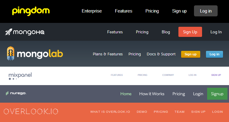
Examples from startups that get it right:
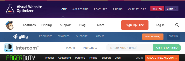
(I especially like gliffy’s “Start Drawing,” which implies how quickly you can get started, and directly relates to their product: an app for easily drawing diagrams.)
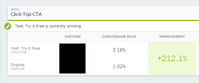
Case study: Getting 3x more clicks by changing two words.
Take this example from one of my clients. Like many software companies, Scalyr—a log aggregation and monitoring tool—asked its visitors to “sign up.” I suggested that we test a version of the button that gives and compels: “Try it Free”. Here’s what happened:
Asking visitors to Try it Free increased clicks by 212%.
Complete obliteration of the old “Sign Up” button, and a huge win for a test that took two minutes to set up.
Now try it yourself...
Test a variation of your “sign up” button with something that gives, compels, and is tied to your product. It’s one of the easiest things to test, and could have a huge effect on your conversion rates. If you follow my advice then you’re almost certain to do better than asking visitors to “sign up.”