Don't Design Your Emails
I used to dread setting up email automation and email campaigns.
Why? Because before a single sales or marketing email could be sent, it needed a design.
In my attempt to sidestep this time-consuming process, I learned that plain emails not only save time but work better.
Why Design is a Barrier to Emails
If you ever had to go through the hair-pulling process of designing emails, then you understand. If you haven’t, here’s why it’s such pain:
- Email tools/clients are inconsistent in how they render HTML and CSS. A designed email might look great in Gmail, broken in Outlook, and unreadable in Apple Mail.
- Half of all emails are opened on mobile devices (according to one study). Email looks good in different clients? Great, now make it work on a 4" screen just as well as on a desktop.
- Email require their own flavor of HTML and CSS. Want to have rows or columns in your layout? You'll have to use
<table>tags—a method long buried by web developers. There's also no support for external stylesheets, element position styling, and so on... - There are email templates available, but they don't eliminate design work. Those templates must still be edited to match company branding and the use case.
- The design is one more thing that needs to be approved, thereby adding a delay. Worse, it's a chance for everyone to chime in about their preferred color and font size.
What If...
Having gone through this multiple times with multiple clients, I began wondering whether this is even necessary.
What if the email was… plain?
I didn’t think it was such a bad idea. Here’s why:
- Professionals (ie, corporate buyers) care more about substance and valuable information than pretty designs. This is especially true for technical audiences such as engineers.
- People get dozens of pretty newsletters per day. Each one may look nice, but collectively they look the same and face the same fate: ignored, deleted, or flagged as spam. Perhaps a plain email would stand out.
- I've learned that "ugly" could be effective.
More importantly, using a plain email would save lots of time and effort. As a goal-driven-lazy person, that’s a good enough reason to start experimenting.
Testing Plain vs Designed Emails
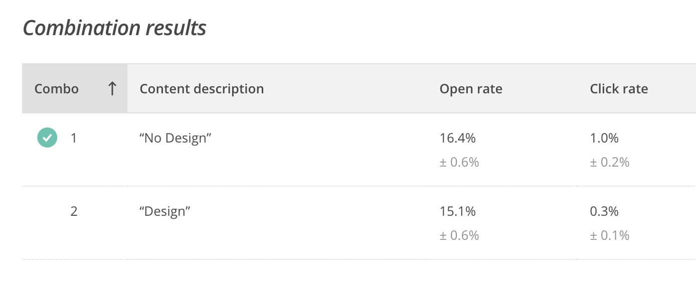
As one example, I tested two versions of a newsletter that went out to 24,000+ recipients:
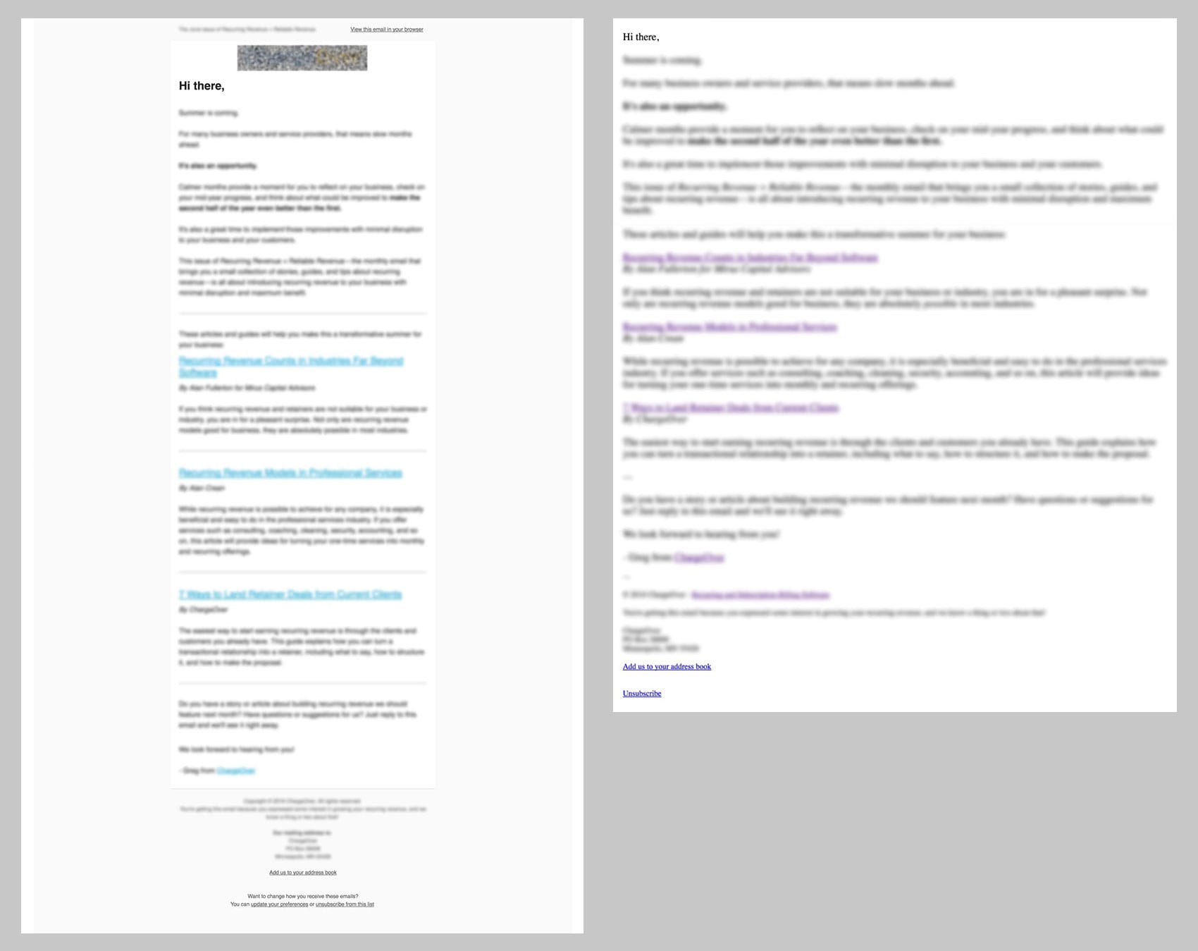
Half of the recipients received the version on the left. It uses a basic template from Mailchimp, and looks like a standard marketing newsletter.
The other half received the version on the right. It has no styling whatsoever.
Which version do you think received more opens and clicks?
The Result
The plain email — which took no time to design or code — was opened by more recipients and had 3.3x more clicks than the designed email.
This is just one example. I’ve performed similar tests for all kinds of emails:
- User onboarding emails
- Cold sales emails
- Webinar invitations
- Newsletters
- Product updates
- And so on...
The plain, unstyled emails resulted in more opens, clicks, replies, and conversions, every time.
Replies to welcome emails were tripled. Cold emails were getting 30-35% open rates and 3% conversion rates, which is incredible.
Sending emails went from an occasional chore to a major source of new leads and customers.
Why Plain Emails Work (Better)
Why are the plain emails crushing the performance of designed emails?
Here’s what I suspect:
- They're less likely to be caught in spam filters. Having less HTML and fewer non-text elements such as images lowers the likelihood of triggering spam filters. You can use a free spam checker to validate this by testing plain and designed emails.
- They're less likely to go into the "Promotions" tab in Gmail (used by ~16% of all email users), for the same reasons above. From my testing, the plain emails typically end up in the Updates tab and some times even in the primary tab. Of course, the text in the email also affects this.
- They don't look like advertisements. The second the recipient interprets your email as an ad, promotion, or sales pitch — and it does take just a second — its chances of being read or acted upon plummet towards zero. A plain email leads people to start reading it before jumping to conclusions.
- They feel more personal. It's no handwritten note, but it's much more personal than an over-designed email with the recipient's first name crammed somewhere inside.
Now I look forward to setting up email campaigns because I know I can focus on the content, waste no time on design, and still get great results.
Try It Yourself
If you’re already running email campaigns, then A/B test plain versions of your emails. Most email service providers, such as Mailchimp, Constant Contact, Hubspot, and Marketo, have built-in A/B testing functionality.
If you’re not already using email for to get leads or customers leads, then:
- You're leaving a lot of revenue on the table. Contact me for help.
- Your barrier to setting up email marketing just got lower. Now you know there's no need to worry about meticulously designing or coding emails before sending them out.
Marketing emails don’t need to be pretty to be effective.
Stop over-designing them, or don’t design them at all. And keep them short. You’ll save yourself time, money, and frustration.
They’ll work better, too.